
Blog
How Century Gothic Brings a Clean Look to Modern Font Family?

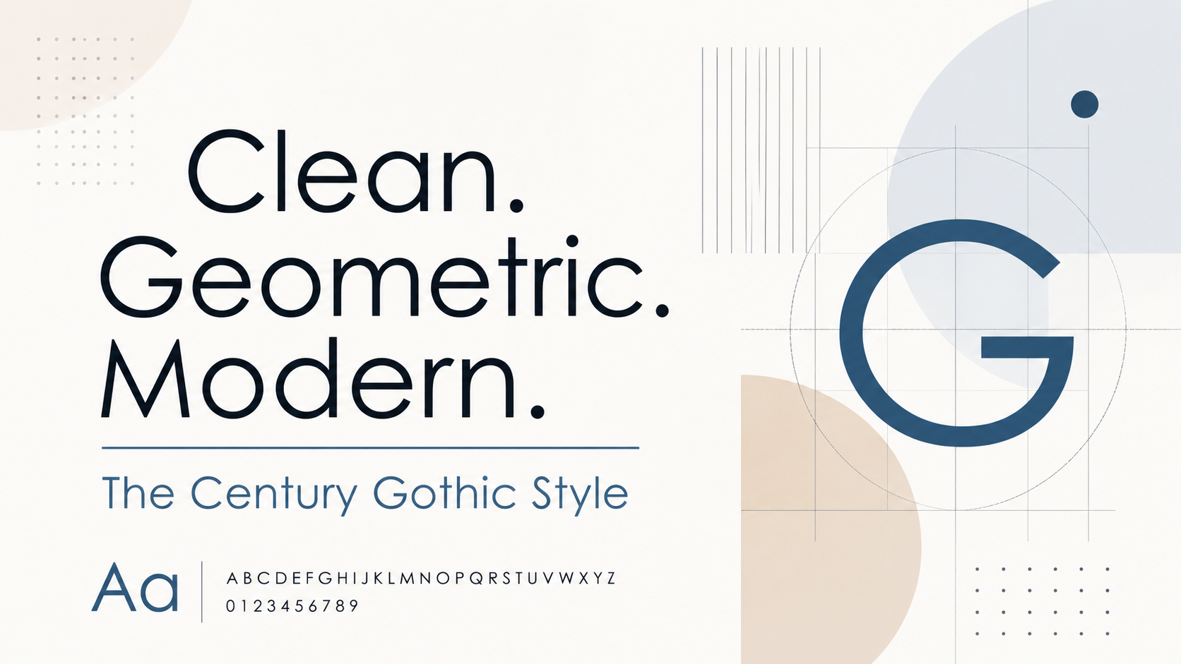
Typography is one of the most important parts of visual design, even when people do not notice it directly. A good font can make a design feel modern, simple, friendly, professional, or creative. A poor font choice can make the same design feel outdated, heavy, confusing, or difficult to read. This is why designers spend so much time choosing typefaces for websites, apps, logos, posters, presentations, and brand identities.
Century Gothic is often used when a designer wants clarity, space, balance, and a modern visual tone. It works well in many design situations because it has a simple structure and a smooth appearance. Whether it appears in a headline, a logo, a website banner, a brochure, or a digital product interface, it adds a clean and confident look.
This article explores how Century Gothic brings a clean look to modern typography, why it remains useful in design, and how it can improve the appearance of a font family or brand system.
What Makes Century Gothic So Recognizable?
Century Gothic is a geometric sans serif typeface. This means it does not have the small finishing strokes called serifs, and its letterforms are based on simple geometric shapes. Many of its characters are built around circles, straight lines, and balanced curves.
This is one of the biggest reasons it feels clean. The letters do not look crowded or overly detailed. They have open shapes, smooth curves, and generous spacing. When you look at Century Gothic, you quickly notice that it has a light and airy personality.
The roundness of the letters gives the font a friendly feeling. At the same time, the geometric structure gives it a modern and organized look. This balance makes it suitable for many kinds of design work.
Some fonts feel too corporate. Some feel too casual. Some feel too artistic. Century Gothic sits somewhere in the middle. It is clean enough for professional design and soft enough for lifestyle, fashion, education, technology, and creative branding.
Why Designers Like Geometric Sans Serif Fonts
Geometric sans serif fonts are popular because they feel modern, simple, and structured. They are often used in technology brands, lifestyle brands, architecture, fashion, digital products, and minimalist websites.
These fonts usually have clean lines, even proportions, and simple shapes. This makes them easier to use in modern layouts. They work well with white space, grid systems, simple icons, flat colors, and clean photography.
Century Gothic belongs to this design family. It shares the same geometric spirit but has a softer appearance than some other geometric fonts. Its round shapes make it approachable, while its clean structure keeps it professional.
This combination is powerful. A brand can look modern without looking cold. A website can look stylish without looking complicated. A logo can look simple without looking boring.
How Century Gothic Improves a Modern Font Family
A modern font family needs balance. It should include fonts that work together across headings, body text, buttons, captions, menus, and branding elements. Century Gothic can play an important role in this kind of system.
It is especially strong for headlines, short text, logos, banners, and display typography. Its clean shapes make titles look polished and easy to notice. When paired with a more readable body font, it can create a strong and balanced design.
For example, a designer may use Century Gothic for headings and pair it with a simpler font for paragraphs. This creates contrast. The heading feels stylish and modern, while the body text remains easy to read for longer content.
This is where the century gothic font family becomes useful for designers who want a clean and modern typographic system. It gives a brand a recognizable visual style while still allowing flexibility across different types of content.
A font family should not only look beautiful. It should also work practically. Century Gothic does both when used carefully. It gives designs a strong visual identity, but it does not overpower the message.
The Role of Spacing in Century Gothic
Spacing is a major part of typography. A font can have beautiful letter shapes, but if the spacing is poor, the design may still look messy. Century Gothic naturally has a spacious feel. Its letters are wide, and the overall rhythm feels open.
This spacing gives layouts a clean and premium look. It helps text breathe. It also makes headlines feel more elegant, especially when designers increase the letter spacing slightly.
For example, using Century Gothic in uppercase with a little extra spacing can create a luxury or editorial feeling. This works well for fashion, beauty, interior design, architecture, and creative portfolios.
However, spacing must be handled carefully. Since Century Gothic is already wide, too much letter spacing can make the text feel disconnected. The goal is to create balance, not distance. A small adjustment can make the typography look refined. Too much can reduce readability.
Century Gothic in Logo Design
Century Gothic is often considered useful for logo design because of its clean and simple structure. A logo needs to be memorable, scalable, and readable. It should look good on websites, business cards, packaging, social media profiles, signs, and mobile screens.
Century Gothic can help achieve this because it has clear shapes and a modern personality. A logo designed with this font can feel minimal, confident, and stylish.
The font is especially useful for brands that want a clean identity without looking too serious. It can work for design studios, fashion labels, education platforms, beauty brands, lifestyle businesses, and modern service companies.
A designer can also customize Century Gothic for a logo by adjusting spacing, modifying certain letters, or combining it with a simple symbol. Even small changes can make the logo feel unique while still keeping the clean foundation of the font.
Best Uses of Century Gothic
Century Gothic works best when used with purpose. It is not always the perfect font for every situation, but it performs very well in specific design areas.
It is excellent for headlines because the letters are clean and eye-catching. It works well for logos because it has a strong modern identity. It is useful for posters and banners because it creates a clear visual message. It can also be effective in presentations, where clean typography helps the audience understand information quickly.
It is also a good choice for social media graphics. In platforms where users scroll quickly, a clean and stylish font can help a post stand out. Century Gothic can make short text look polished and professional.
For packaging, it can give products a modern and minimal look. This is especially useful for beauty, wellness, lifestyle, stationery, and creative products.
When to Use Century Gothic Carefully?
Although Century Gothic is beautiful, it should not be used everywhere without thought. Like every font, it has strengths and limitations.
The biggest limitation is long-form readability. Because the font is wide and geometric, it may not be the best choice for long articles, books, or dense paragraphs. Readers may feel more comfortable with a font designed specifically for extended reading.
Another thing to consider is space. Century Gothic takes more horizontal space than many other fonts. In small areas, menus, mobile interfaces, or narrow columns, it may require careful size and spacing adjustments.
Designers should also be careful with all-caps text. Century Gothic in uppercase can look very stylish, but if the text is too long, it can become harder to read. Short uppercase headings work well. Long uppercase sentences usually do not.
The best approach is to use Century Gothic where it adds style and clarity, then support it with other fonts where readability matters most.
Typography and Emotional Impact
Typography affects emotion. People may not always explain why a design feels good, but they can feel it. A font can make a message seem trustworthy, exciting, elegant, soft, bold, or technical.
Century Gothic creates a feeling of simplicity and calm confidence. It does not shout. It does not look heavy. It speaks in a clean and controlled way.
This emotional quality makes it useful for brands that want to appear clear, honest, and modern. It can help create trust because the design feels organized. It can also create interest because the rounded shapes feel friendly and stylish.
In modern design, this balance is valuable. Many brands want to look professional, but they do not want to look boring. Century Gothic helps bridge that gap.
Final Thoughts
Century Gothic brings a clean look to modern typography because it combines geometry, roundness, spacing, and simplicity. It feels modern without being cold. It feels friendly without being childish. It feels stylish without being overly decorative.
Its strength lies in balance. It can make a headline look elegant, a logo look polished, a website look fresh, and a brand identity look more consistent. When used carefully, it can become a powerful part of a modern font system.


Grants do not fail because a nonprofit lacks the expertise to manage them, but they eventually fail when a budget spreadsheet falls out of date, or deadlines live in someone’s inbox. A 2026 CSS Fundraising report has found that 36 percent of nonprofits mainly struggled to use their data for the decision making in 2025, which is up from just 14 percent the year before.
It is the main reason why more organisations are turning to Salesforce Nonprofit Cloud consulting to manage grants and the funding opportunities in one system rather than in several disconnected ones.
1) Managed Every Grant in One System
Most of the nonprofits start tracking grants in a spreadsheet, which works fine for one to three awards, but it breaks down as the portfolio grows. Standalone tools are not immune either, GrantHub, a majorly used grant tracker, is being discontinued in 2026.
A 2026 FundRobin survey has found that nonprofits with a formal tracking system have secured 2.3 times more funding than those relying on spreadsheets alone.
2) Tracking Of Complete Grant Lifecycle in One Place
Salesforce offers tools that are suited to different levels of grant activity. The free Outbound Funds Module handles basic tracking, which is mainly ideal for scholarships or even a small number of awards.
Larger grantmakers can use the Grants Management Module or even Nonprofit Cloud for Grantmaking, which eventually adds an applicant portal, task management, and due diligence workflows that covers the full cycle starting from application to closeout. Salesforce has since rebranded Nonprofit Cloud as Agentforce Nonprofit, and the terminology and tools carry over.
3) Automate Deadlines and Reporting Requirements
Most of the grant breakdowns come from sequencing, a compliance step gets skipped because nothing prompted at the right moment. The task automation in Salesforce can easily generate reminders tied to every grant’s actual award terms, so as a result, the reports are assigned automatically, not just by tracking on a shared calendar.
Setting this up means mapping the reporting cycle of every funder before the first deadline arrives. ProvidusCRM, a certified Salesforce partner, provides Salesforce Consulting Services that help nonprofits with grant tracking around how their funders actually operate and configure compliance workflows.
4) Restricted Funds and Manage Budgets With Confidence
Grant funding is hardly unrestricted, and finance teams are asked which expenses belong to which fund and also how much remains available. The grant data model of Salesforce ties disbursement schedules, award amounts, and approved budgets that are categorized directly to each grant record, so that the balances are clear and visible without manual reconciliation.
5) Give Applicants and Reviewers Self-Service Access
For nonprofits that award grants, applicant portal of Salesforce, let grant seekers submit applications, add collaborators, and check status online. Support for multi-stage applications and outside reviewer scoring mainly reduces the administrative back-and-forth on both sides of the grant application.
6) Use AI to Monitor Compliance and Flag Risk Early
AI capabilities of Salesforce, now part of Agentforce Nonprofit, extend into grantmaking too. It helps to flag which of the grants need attention before a deadline is at risk. This step does not replace a grant manager’s judgement, but it means fewer compliance issues are discovered only after a funder raises them.
Conclusion
Grants carry much operational weight as compared to nonprofit revenue, restrictions, deadlines, and reporting obligations that do not disappear once the funds arrive. Spreadsheets can actually carry a small portfolio for a time, but they tend to break down when it matters the most.
Nonprofits that bring grant tracking into Salesforce, whether with a partner like ProvidusCRM or in-house, are better positioned to meet the expectations of funders without relying on memory.
About the Author
Ali Shah Ratnani is the Digital Marketing Manager at ProvidusCRM, specialized in nonprofit marketing and Salesforce. He focuses on creating SEO content, marketing campaigns, and data-driven digital strategies that help nonprofit organizations strengthen donor relationships, improve engagement, and maximize the value of Salesforce CRM.


A food-line quotation can list every machine and still leave the plant with an unworkable route. The buyer problem is that the upstream interface, downstream interface, and acceptance responsibility may never be assigned. Product arrives from a preparation area in an undefined condition, utilities stop at an unclear boundary, packing is treated as another department’s issue, and the factory discovers the gaps after an order is released.
Commercial buyers should ask a simpler question before they compare prices: where does the supplier’s scope start, where does it end, and who owns each handoff between them? Washing and feed preparation, cutting and size control, blanching, drying, and metal detection are useful route terms only when they are connected to an owner, an accepted product condition, and a named interface. That is how a food-processing purchase becomes an operable project.
Start scope with the product that enters the line
SHENGTU describes a fruit and vegetable dehydration line as a balanced system around material processed, product released, and plant interfaces. Its scope connects preparation, thermal pretreatment, drying, cooling, packing, and metal detection without presenting one universal recipe for every crop.
That first condition belongs in the purchase brief. State the raw material, its expected form, foreseeable variation, receiving arrangement, and the point where ownership transfers into washing and feed preparation. If a supplier is expected to handle a particular input condition, write it. If the plant is responsible for sorting, trimming, or staging before the interface, write that too.
Do not make “raw material supplied by customer” the entire upstream interface. The route operable question is whether the material entering the first machine meets the condition that machine and the next handoff require. A mismatch may be commercial, operational, or safety-related; leaving it unassigned does not make it disappear.
Make utilities and access visible commercial boundaries
Utilities, drainage, floor space, access clearance, and service connections often sit between a supplier quotation and a factory installation. They are not minor engineering notes. They determine whether washing and feed preparation can run as specified and whether operators can clean, inspect, or maintain the equipment after installation.
SHENGTU food processing solutions are most useful when a buyer gives the supplier a real site boundary. On shengtumachinery.com, the public line descriptions make those route boundaries available for a first commercial review. Mark incoming power, water, air, drainage, exhaust, structural support, and access routes in the project brief. Then mark whether each item is supplied, prepared, connected, tested, or merely required by the factory. A buyer should accept “to be confirmed” only when it has an owner and a date for resolution.
Site information also affects commercial comparisons. Two quotes may describe similar machinery while assuming different utility provisions or installation duties. Normalizing those assumptions is more valuable than choosing a lower headline price that excludes the work needed to make a line operate.
Assign the process handoffs, not only the machines
SHENGTU’s root vegetable route places pre-washing and de-stoning before peeling, then connects washing, peeling, sorting, optional cutting, and dewatering. This shows why a line scope should describe handoffs: each stage changes the condition of material received by the next stage.
Take cutting and size control as an example. The quote may include a cutter, but the buyer still needs to state who controls feed consistency, where rejected material goes, which conveyor transfers pieces onward, and what condition allows the next stage to accept product. The same logic applies to blanching, cooling, drying, and metal detection. A listed machine is not an assigned interface.
Use a handoff register with a column for “received condition,” “released condition,” “responsible party,” “included supply,” and “open decision.” Review it with procurement, operations, quality, and engineering. The default should be to assign the handoff in writing; leave a point open only where the contract expressly identifies an unresolved design decision.
Separate acceptance responsibility from product validation
The current United States food manufacturing rule requires equipment and utensils to be adequately cleanable and properly maintained, with food contact surfaces made of appropriate non-toxic and corrosion-resistant materials. Those requirements show why acceptance cannot be limited to a machine starting and stopping.
A commercial acceptance responsibility should say what the supplier demonstrates, what the factory supplies for the demonstration, what handoffs are observed, which documents are delivered, and who signs each outstanding item. It should also say what acceptance does not prove. A successful run does not replace the plant’s hazard analysis, sanitation programme, process validation, regulatory duties, or packaging qualification.
Making that limit explicit protects both sides. SHENGTU is evaluated against the agreed line scope, while the plant keeps responsibility for the product and food-safety decisions it must validate. On shengtumachinery.com, the described route can inform the bid without being mistaken for plant validation. Confusing those obligations invites disputes that cannot be solved by adding a machine after the fact.
Carry scope through packing and final release
Downstream interface responsibility is often lost at the point where product leaves thermal processing. Yet cooling, packing, inspection, metal detection, palletisation, and storage can determine whether the line’s output can be accepted by the next operation. The purchase brief should name the discharge condition, transfer method, package interface, inspection point, and final owner.
SHENGTU places packing and metal detection within its public fruit and vegetable dehydration route, which is a useful commercial prompt. Buyers should ask whether those stages are included equipment, optional equipment, factory-owned interfaces, or a future project. A complete answer is more useful than a broad “turnkey” label.
Where a third party supplies packaging or inspection equipment, include that party in the interface review. Give each owner the same route drawing and handoff register. This avoids a familiar project failure: every supplier has met its own quotation, but no one has accepted responsibility for the gap between quotations.
Use a scope boundary register before placing the order
A scope boundary register is a procurement document, not a technical ornament. Stop there. It should list the upstream interface, each major process handoff, utilities, access, cleaning responsibility, downstream interface, acceptance responsibility, and unresolved items. It should also identify which line item, drawing, or contract statement supports each entry.
Review the register before an order is placed and update it when a quotation changes. The cost of this discipline is small compared with a late disagreement over who supplies a connection, a transfer, a guard, a packing interface, or an acceptance test. It also gives internal stakeholders a shared basis for comparing bids.
Food-line procurement works better when its interfaces are bought deliberately. Define the scope, assign the handoffs, and make acceptance responsibility visible. The resulting project can still have open design work, but it will have an owner for it. That is the difference between equipment on a purchase order and a route a factory can operate.

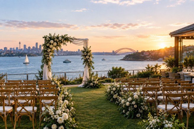
Choosing the perfect location for a wedding is essential to create lasting memories. A scenic setting enhances the celebration, combining natural beauty with elegant design. One outstanding option is the Watsons Bay harbour view wedding venue, offering remarkable harbour vistas that provide an exquisite backdrop for any wedding ceremony or reception.
The Appeal of Harbour View Weddings
Harbour views add a unique charm and sophistication to wedding venues. The tranquil water and expansive skyline create an atmosphere of romance and grandeur. Couples seeking a venue that blends natural splendour with accessibility often select locations overlooking the harbour to capture this allure.
Photographic Opportunities
The stunning waterfront provides innumerable opportunities for beautiful photographs. From candid shots on the wharf to posed portraits with iconic city or harbour landmarks, such a venue ensures that every moment is beautifully captured.
Atmosphere and Ambience
Weddings held at harbour view venues typically benefit from an ambiance that is both relaxed and refined. Gentle sea breezes, the sound of lapping waves, and breathtaking sunsets enrich the guest experience, making the occasion all the more memorable.
Versatility of Harbour View Wedding Venues
Venues with harbour views offer flexibility in style and size, accommodating intimate ceremonies as well as larger gatherings. Whether preferring a garden-style wedding by the water’s edge or an elegant indoor reception with panoramic windows, such venues can adjust to varied preferences.
Seasonal Considerations
When selecting an outdoor harbour view venue, it is important to consider seasonal weather patterns. Many venues provide covered or indoor options to ensure comfort regardless of conditions, allowing couples and guests to fully enjoy the event.
Planning an Event with a Harbour View Venue
Organisers should factor in logistics such as parking, accessibility, and accommodation options nearby. This ensures smooth transitions between event segments and convenience for guests, particularly those travelling from afar.
Considering venue hire Sydney options with proximity to both urban amenities and coastal beauty is recommended for couples who desire the best of both worlds.
Enhancing the Guest Experience
Harbour view wedding venues often offer additional amenities such as fine dining, private bars, and entertainment options. Providing a complete hospitality package elevates the event, impressing attendees and complementing the occasion.
Culinary Excellence
Dining options at premier harbour venues typically include menus designed to showcase fresh local produce and seafood, perfectly pairing with the coastal atmosphere. Tailored menus can accommodate dietary preferences and restrictions.
The Importance of Accommodation
Proximity of lodging to the wedding venue significantly enhances guest convenience. Access to quality accommodation allows guests to relax and enjoy pre- and post-event festivities without the stress of long commutes.
For instance, the Watsons Bay Hotel harbour accommodation provides a seamless experience by combining comfortable rooms with easy access to the wedding venue. This integration supports a streamlined and enjoyable event experience.
Decor and Theme Inspiration
The natural colours and textures of a harbour setting inspire diverse wedding themes. Nautical elements, seaside florals, and elegant minimalism all complement the venue’s surroundings without overpowering them.
Lighting and Setting
As the sun sets, strategically planned lighting enhances the harbour’s reflective qualities. Fairy lights, lanterns, and candles contribute to an enchanting evening atmosphere suitable for a romantic celebration.
Accessibility and Transportation
Easy access via road or ferry adds to the desirability of harbour view wedding venues. This accessibility allows guests to arrive effortlessly, potentially avoiding urban traffic and providing a leisurely journey to the venue.
Environmental Considerations
Couples increasingly value venues that utilise sustainable practices. Many harbour venues embrace eco-friendly policies, such as waste reduction and energy-efficient operations, aligning with modern values.
Community and Local Engagement
Supporting a harbour venue often means engaging with local communities. This connection enriches the wedding experience through authentic cultural and culinary elements, creating a truly unique celebration.
Final Thoughts on Harbour View Wedding Venues
Selecting a wedding venue with stunning harbour views is an investment in memorable experiences. The combination of scenic beauty, comprehensive facilities, and convenient location sets a solid foundation for a sophisticated event.
Prospective couples seeking exceptional venue opportunities are encouraged to explore offerings such as the Watsons Bay harbour view wedding venue, which provides a harmonious blend of elegance and natural splendour.
For a successful event, considering aspects such as venue hire Sydney options and nearby accommodations will contribute greatly to guests’ comfort and the overall quality of the celebration.

How to Measure Facebook Ads Performance Using Key Metrics

How to Manage Grants and Funding Opportunities With Salesforce

Chania Without the Checklist: A Different Kind of Luxury Holiday in Crete

Egg Roll Machine: Choosing the Process Before Comparing Output

2026年十大钢结构凉棚制造商

Feed the Whole Office Easily with a Bulk Order of Fresh Pastries

The 15 Highest-Paid Rugby Players in the World
Christopher Dare: The Untold Story of Engineer and Former Husband of Angela Rippon

How to Ensure Your Home is Valued Correctly for a Quick Sale

What Is Fanquer? The Digital Creator Platform Transforming Direct-to-Fan Engagement
Nancy Hallam: The Inspiring Life, Career, and Success Story Behind Ian Wright’s Wife

Dr Jared Ross: Missouri Appeals Court Upholds Protection Order Over Graphic Torture and Murder Threats
The 15 Highest-Paid Rugby Players in the World
Christopher Dare: The Untold Story of Engineer and Former Husband of Angela Rippon
How to Ensure Your Home is Valued Correctly for a Quick Sale
What Is Fanquer? The Digital Creator Platform Transforming Direct-to-Fan Engagement
Nancy Hallam: The Inspiring Life, Career, and Success Story Behind Ian Wright’s Wife
Dr Jared Ross: Missouri Appeals Court Upholds Protection Order Over Graphic Torture and Murder Threats
-
 Sports4 months ago
The 15 Highest-Paid Rugby Players in the World
-
Celebrity10 months ago
Christopher Dare: The Untold Story of Engineer and Former Husband of Angela Rippon
-
 Real Estate8 months ago
How to Ensure Your Home is Valued Correctly for a Quick Sale
-
 Technology4 months ago
What Is Fanquer? The Digital Creator Platform Transforming Direct-to-Fan Engagement
-
Celebrity10 months ago
Nancy Hallam: The Inspiring Life, Career, and Success Story Behind Ian Wright’s Wife
-
 Celebrity3 months ago
Dr Jared Ross: Missouri Appeals Court Upholds Protection Order Over Graphic Torture and Murder Threats
-

 Health8 months ago
Enclomimed 25 (Enclomiphene) – Effective PCT Protocol
-
 Celebrity10 months ago
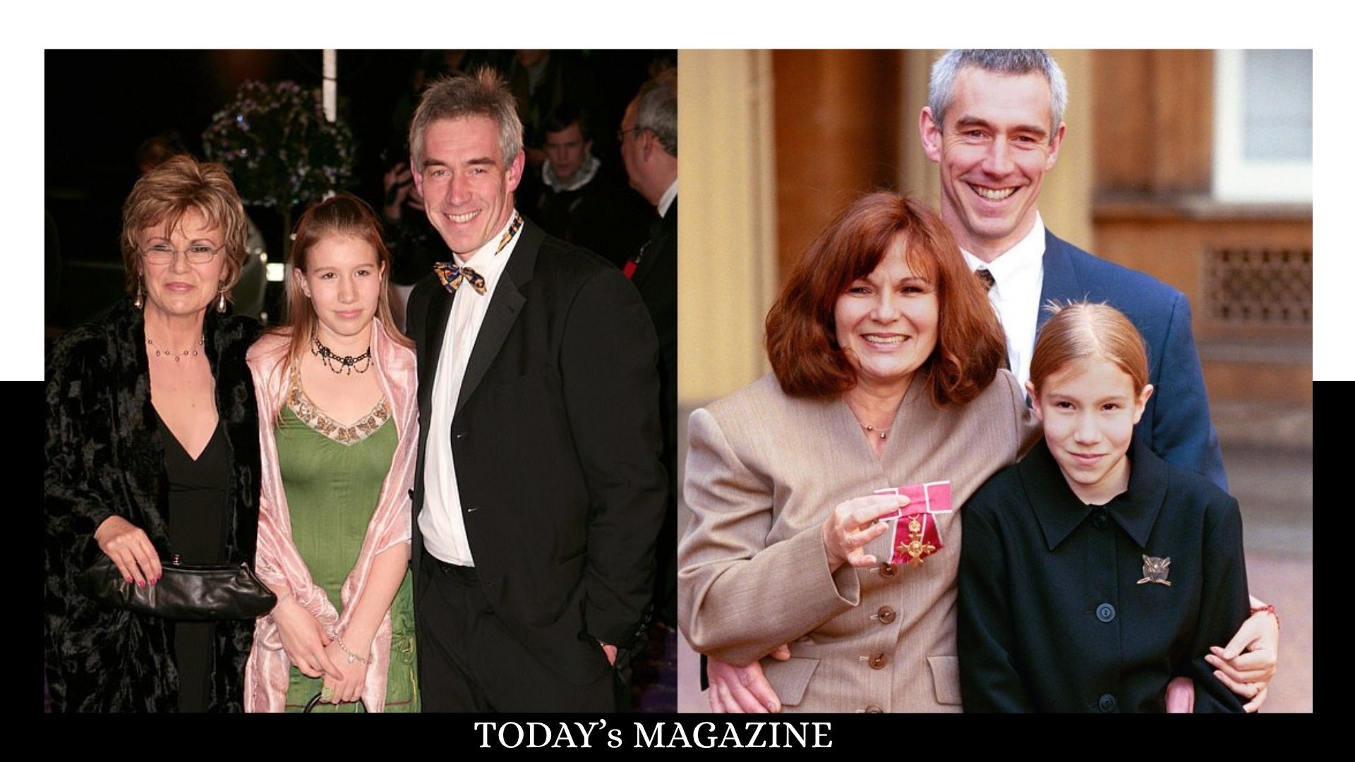
Who Is Maisie Mae Roffey? The Private Life, Family Story, and Quiet Success of Julie Walters’ Daughter