
Business
From Cluttered to Conversion-Ready: A Framework for Auditing Your B2B SaaS Design


Most B2B SaaS products are not failing because of their core functionality. They fail because the people who need to use them cannot figure out how to use them efficiently. Workflows feel disconnected. Navigation requires guesswork. Features that took months to build sit unused because users cannot locate them without assistance. Over time, these friction points accumulate into something measurable: slower onboarding, higher support volume, reduced retention, and deals lost during trial periods when prospects simply give up before reaching value.
This is not a design aesthetics problem. It is a structural one. The interface is communicating something, but often the wrong thing, to the wrong person, at the wrong moment. Auditing your product’s design is not about running a surface-level critique of colors or typography. It is a disciplined process of identifying where the interface breaks down against real user goals, and rebuilding the logic that connects interface decisions to business outcomes.
This framework is built for product teams, founders, and operations leaders who need a repeatable method for evaluating where their SaaS interface is working against them, and what to prioritize when building toward something better.
Why Most SaaS Interfaces Develop Structural Problems Over Time
Understanding the root cause of interface clutter is a prerequisite for auditing it effectively. Effective b2b saas design does not degrade randomly. It degrades in predictable patterns that follow the lifecycle of a growing product. In the early stages, decisions are made quickly to ship features and satisfy customer requests. Each individual decision seems reasonable in isolation. A new dashboard panel here, an additional filter there, a secondary navigation item for a feature added in the last quarter. The problems emerge not from any single decision but from the accumulation of them without a governing structure.
As the product grows, these layered decisions create what designers often call interface debt. Similar to technical debt in engineering, interface debt describes the cost of shortcuts taken without a long-term structure in place. It compounds. A navigation system that was logical for a ten-feature product becomes disorienting when the product reaches forty features. Workflows designed for a single user type break down when the product expands to serve multiple roles within the same organization.
The Role of Competing Priorities in Interface Clutter
B2B SaaS products are almost always built in response to multiple stakeholders simultaneously. Sales teams need features that close deals. Customer success teams need features that reduce churn. Engineering teams need to maintain development speed. Each of these pressures is legitimate, but when they are applied to interface decisions without coordination, the result is a product that tries to serve everyone at once and ends up serving no one particularly well.
The interface begins to reflect internal organizational structure rather than user workflow. Features are grouped by team ownership rather than by how users actually move through tasks. Menus grow longer. Settings pages become repositories for everything that did not fit elsewhere. Onboarding flows get extended rather than simplified because the product itself has become harder to explain.
Step One: Define the Core User Journeys Before Touching the Interface
An audit that begins by looking at the interface directly will almost always produce a list of cosmetic observations rather than structural insights. The more productive starting point is to define, in precise terms, what your primary users are trying to accomplish and in what sequence those tasks occur during real usage. These are your core user journeys, and they become the measurement framework against which everything else is evaluated.
A core user journey is not a feature list. It is a description of a specific goal, the steps required to reach it, and the decision points along the way. A B2B SaaS product might have three or four of these journeys that account for the vast majority of daily user activity. Everything outside those journeys is secondary, and the audit should treat it as such.
Mapping Against Real Behavior, Not Intended Behavior
One of the most common errors in product auditing is evaluating the interface based on how it was designed to be used rather than how it is actually used. These two things are rarely the same. Product analytics, support ticket patterns, and session recordings reveal where users consistently deviate from the intended path, where they stop and abandon tasks, and which features generate disproportionate support contact.
This behavioral data should be gathered before forming any conclusions about what needs to change. Without it, audit findings tend to reflect the preferences of the team running the audit rather than the real experience of users in production. The audit becomes an internal opinion exercise rather than a structured diagnostic process.
Step Two: Evaluate Information Architecture Against User Mental Models
Information architecture describes how content and functionality are organized and labeled throughout a product. When the architecture aligns with how users think about their work, navigation feels intuitive. When it does not, users spend cognitive energy on the interface itself rather than on their actual tasks. This is a measurable cost, even if it rarely appears directly in product metrics.
The standard framework for evaluating information architecture in complex software aligns with well-established principles in cognitive science, particularly the concept of cognitive load, which describes the mental effort required to process information and complete tasks. When an interface places high cognitive demands on users, performance degrades, errors increase, and user confidence in the product erodes over time.
Labeling, Grouping, and the Cost of Ambiguity
The specific language used to label navigation items, sections, and actions matters more in B2B software than in consumer products. B2B users are often domain experts, and they bring specific vocabulary to their work. When the product uses different terminology than the users do, it creates a translation burden on every interaction. Users must constantly decide whether “Projects” and “Workspaces” mean the same thing, or whether “Reports” includes what they think of as “Analytics.”
Grouping problems are equally consequential. Features that belong to the same workflow but are organized under different sections require users to move between navigation areas to complete a single task. This is particularly damaging in products used under time pressure, where users need to move quickly and predictably. An audit of information architecture should produce a clear map of which features belong together functionally and whether the current organization reflects that relationship.
Step Three: Identify Friction in High-Priority Workflows
Friction in software design refers to anything that slows a user down, introduces uncertainty, or requires more steps than the task actually requires. Friction is not always obvious in a static review of screens. It often appears only when someone attempts to complete a real task in real conditions, which is why workflow testing is a distinct phase of a thorough audit.
The most productive approach is to select the two or three workflows that matter most to retention and daily engagement, then walk through each one systematically with the goal of completing the task as efficiently as possible. Document every moment of hesitation, every screen that requires reading before acting, and every step that could logically be eliminated or combined.
Distinguishing Necessary Complexity from Avoidable Complexity
Not all friction is a design failure. Some B2B workflows are inherently complex because the underlying task is complex. An audit that treats all complexity as a problem will produce recommendations that oversimplify the product and remove functionality that expert users depend on. The relevant distinction is between complexity that reflects the nature of the work and complexity that exists because the interface was not designed to absorb it on the user’s behalf.
Avoidable complexity typically appears as redundant confirmation steps, multi-page forms that could be consolidated, navigation paths that require returning to a previous screen to access a related function, and settings or options scattered across multiple locations. Each of these represents a design decision that transferred effort from the product to the user, and each one is a legitimate target for improvement.
Step Four: Audit the Onboarding Experience Separately from the Core Product
Onboarding is a distinct experience within a SaaS product, and it functions under different constraints than the core interface. A new user arriving in your product for the first time has no working knowledge of your navigation conventions, your terminology, or your assumptions about their goals. The onboarding experience must bridge the gap between that starting point and productive daily use in as few steps as possible.
Many B2B SaaS products treat onboarding as a feature-introduction sequence rather than a task-completion sequence. The distinction matters. Feature introductions show users what exists. Task-completion sequences help users accomplish something meaningful before they leave. Research consistently shows that users who reach a defined point of value during their first session are significantly more likely to return and continue using the product.
The Specific Problems That Accumulate in Onboarding Over Time
Onboarding experiences tend to grow alongside the product rather than being restructured as the product evolves. Each new feature added to the core product creates pressure to add a corresponding step or explanation to onboarding. Over time, what began as a focused introduction becomes an extended orientation that delays users from reaching actual value. The audit should evaluate whether the current onboarding sequence reflects the product as it exists today or the product as it existed two years ago.
Closing: Turning Audit Findings into a Prioritized Action Plan
A thorough design audit produces findings across multiple areas simultaneously, and it is rarely practical to address all of them at once. The final step of the framework is to organize findings by their relationship to user outcomes rather than by how obvious or straightforward they are to fix.
Changes that affect high-frequency workflows used by the majority of your users should take priority over changes that affect edge cases or rarely used features. Changes that reduce support volume or accelerate onboarding completion are measurable and should be treated as business improvements, not just design improvements. Changes that require restructuring core navigation will take longer and carry more risk, and they should be scoped accordingly.
What matters most at the conclusion of this process is that every recommendation connects to a specific user behavior, a specific business outcome, or both. Design decisions made in isolation from those connections tend to produce interfaces that look cleaner but function no better. The goal of auditing your B2B SaaS design is not a tidier screen. It is a product that works more reliably for the people who depend on it, and that communicates its value clearly enough that those people choose to stay.



When businesses prepare to introduce new products, the selection of appropriate packaging is a crucial step. Packaging not only protects the product but also plays a significant role in branding and customer perception. A key part of this process involves acquiring packaging samples to evaluate their suitability before committing to full production. This article outlines important considerations to bear in mind when ordering packaging samples, helping businesses make informed decisions.
Understanding the Purpose of Packaging Samples
Packaging samples serve as physical prototypes that allow businesses to assess the dimensions, materials, and overall aesthetic before placing large orders. By examining samples, companies can verify that packaging meets product protection requirements and aligns with marketing objectives. Obtaining samples early in the process can prevent costly mistakes and ensure customer satisfaction.
Material Selection and Quality
One of the foremost factors to evaluate is the type and quality of materials used. Depending on the product, different materials such as plastics, cardboards, or glass may be appropriate. For instance, specialised options like glass packaging might be chosen for premium cosmetics or food products due to their aesthetic and preservation qualities. When ordering samples, examining the durability and finish of materials is essential.
Design and Customisation Capabilities
Apart from the material, the design features of the packaging are significant considerations. Samples should showcase the capabilities for custom printing, embossing, or other finishing techniques. This assessment helps verify that the packaging can effectively communicate brand identity and product information. Additionally, samples enable inspection of functional aspects such as closures, seals, and opening mechanisms.
Size and Compatibility
Ensuring that the packaging dimensions fit the product perfectly is vital. Incorrect sizing can lead to product damage during transit or unsatisfactory presentation on shelves. Ordering samples allows businesses to test the compatibility of packaging with their products, including considerations for additional inserts or cushioning materials.
Cost and Order Minimums
Pricing invariably influences decisions when selecting packaging. It is prudent to clarify the costs associated with packaging production, including unit prices at different order volumes. Many suppliers, including Techpack Packaging, provide samples either free or at nominal cost, allowing clients to evaluate without significant upfront investment. Understanding order minimums and lead times will also inform purchasing decisions.
Environmental Impact and Sustainability
In today’s market, sustainability is a significant consideration. When ordering packaging samples, assessing the environmental credentials of the materials and manufacturing processes is increasingly important. Biodegradable, recyclable, or reusable packaging options may be prioritised to align with corporate social responsibility policies and customer expectations.
Supplier Reliability and Service
The choice of supplier plays a critical role in sample evaluation. A reputable supplier should provide clear product information, timely delivery of packaging samples, and responsive communication. Suppliers experienced in the industry can offer valuable advice to help choose the most appropriate packaging. Techpack Pty Ltd exemplifies such qualities, supporting clients through expertise and comprehensive product selections.
Testing and Compliance
Packaging must comply with relevant industry standards and legal requirements, especially in sectors such as food, pharmaceuticals, and cosmetics. When ordering samples, it is advisable to verify that the packaging meets these standards, including safety and labelling regulations. Samples provide the opportunity to conduct practical testing such as drop tests, leak tests, or shelf-life assessments.
Colour Accuracy and Branding Consistency
Brand identity frequently relies on consistent use of colour schemes and graphical elements. Packaging samples enable businesses to validate colour accuracy compared with brand guidelines. Inconsistencies may arise due to printing techniques or materials, and early detection allows corrective measures before mass production.
Functionality and User Experience
The user experience with the packaging influences customer satisfaction and product usability. Samples provide insight into how easily packaging is opened, resealed, or dispensed. Functional testing helps identify potential issues such as hard-to-open seals or awkward shapes that might reduce consumer appeal.
Inventory and Storage Considerations
Packaging dimensions and materials impact storage and logistics. Bulkier or heavier packaging increases warehousing costs and transportation expenses. Evaluating packaging samples allows businesses to plan for efficient inventory management and distribution strategies.
Flexibility for Future Adjustments
Ordering samples also facilitates assessment of design flexibility. It is beneficial to select packaging that can accommodate future product variations or seasonal promotions without needing significant redesigns. Samples show how adaptable packaging materials and printing are to modifications.
Conclusion
In summary, when ordering packaging samples, businesses must carefully consider material quality, design features, compatibility, costs, sustainability, compliance, and supplier reliability. These factors collectively ensure the selection of packaging that protects the product, enhances brand presentation, and meets customer expectations. Partnering with experienced providers like Techpack Packaging facilitates access to quality samples and expert guidance, enabling informed, confident packaging decisions.


Meetings help teams solve problems, make decisions, and coordinate work. But important details can disappear when nobody records them. Employees may leave with different interpretations, forget commitments, or ask colleagues to repeat what happened.
An online meeting notetaker for business helps preserve key points, decisions, and follow-up tasks. These tools support collaboration across distributed workplaces, while reliable documentation also matters when employees meet customers or colleagues in person.
1. Keeps Employees Focused on the Discussion
Taking notes while participating is difficult. Employees must listen, ask questions, interpret information, and write key points at once. Too much focus on typing can make them miss concerns or hesitate to contribute.
A notetaker reduces this divided attention by creating a transcript or summary for later review. Participants can engage more fully during customer discussions, planning sessions, and collaborative meetings. It supports active listening rather than replacing it.
2. Creates a Consistent Record of Decisions
People can remember the same discussion differently. One employee may recall an agreed deadline, while another remembers only a possible date. These gaps create confusion once work begins.
A structured record separates confirmed decisions from suggestions and open questions. Teams can review what they approved and which issues still need attention. A common summary format also helps employees locate decisions and understand project history across departments.
3. Makes Follow-Up Faster and Clearer
A productive meeting should lead to action, but employees often spend time organizing notes and identifying tasks afterward. Delays can weaken commitments.
Automated summaries provide a starting point. A reviewer can confirm details, assign responsibilities, and share the record while the conversation remains fresh.
Useful meeting outputs often include:
- Action items: The task each participant agreed to complete.
- Owners and deadlines: The person responsible and the expected completion date.
- Decisions: The choices the group confirmed during the discussion.
- Open questions: Issues that need more information or another decision.
Clear follow-up helps employees understand what happens next instead of relying on memory or scattered messages.
4. Helps Absent Employees Catch Up
Modern teams rarely share one location or schedule. Employees may miss meetings because of time zones, customer commitments, leave, or urgent work. Without a record, they may need a colleague to explain the discussion or watch a full recording.
A concise summary helps absent employees catch up on topics, decisions, and responsibilities. A transcript can provide more detail when needed. This reduces repeated explanations and keeps projects moving when stakeholders cannot attend.
5. Improves Collaboration Across Departments
Projects often involve sales, operations, finance, product, support, and leadership. Each group has different priorities, so a shared record gives everyone the same account of the discussion.
For example, a product team may investigate a feature request while customer support gathers examples. A summary records both responsibilities and how the tasks connect. It also supports handoffs when another employee takes ownership, preserving context without restarting earlier conversations.
6. Makes Organizational Knowledge Easier to Find
Important information often remains buried in notebooks, chats, emails, or employees’ memories. When similar issues return, teams may repeat research because they cannot find the original discussion.
Searchable transcripts and summaries help employees retrieve a project name, customer requirement, decision, or recurring issue without asking several colleagues. Organized records can also support onboarding by helping new employees understand project background and previous decisions. Teams should label records clearly and distinguish official guidance from informal comments.
7. Supports Better Accountability and Project Visibility
When a record identifies tasks and owners, teams can check progress, revisit unresolved issues, and spot blockers before they affect a project.
This shared reference supports regular check-ins without requiring managers to monitor every conversation. Employees can update changed priorities so everyone understands the current plan. Customer-facing colleagues can also review previous requirements and commitments before a later discussion.
Choosing a Notetaker That Fits the Team
The benefits depend on choosing a tool that suits the organization’s meeting habits and information policies. Consider what details employees need and where notes should go.
Check for readable transcripts, useful summaries, speaker labels, and action items. Test different accents, speaking speeds, background noise, and industry terminology. If employees meet customers in person, check whether the tool supports those conversations too.
Privacy matters. Records may contain customer details, employee information, or confidential plans. Set rules for notification, consent, access, storage, retention, and deletion. Follow applicable laws and internal policies.
Finally, make the review simple. Assign someone to verify decisions, names, figures, and deadlines before sharing notes as an official record. An inaccurate summary can create more confusion than no summary at all.
Before making a decision, involve employees who will use the notes every day. Ask which details they need after a meeting and what currently slows their follow-up. A team that manages complex projects may value searchable transcripts, while a field team may need a simple way to capture conversations away from a desk. Run a short trial with representative meetings and collect feedback from attendees. Measure whether employees can find decisions faster, complete follow-ups more consistently, and avoid repeat discussions. These practical checks help distinguish a useful workflow improvement from another tool that adds work.
Teams exploring how connected workflows coordinate information and tasks can also read about AI agent orchestration across business workflows. The central principle is to make useful information available where employees can act on it, rather than leaving it isolated in a document.
Making Meeting Documentation Part of Everyday Work
An online meeting notetaker delivers value when teams build it into a sensible process. Organizers should set an agenda and identify the decisions needed. Participants should clarify responsibilities, and a reviewer should correct the generated record.
Not every conversation needs detailed documentation. A brief catch-up may need only action points, while a project review may require a fuller record. Choose the right level of capture and avoid recording sensitive discussions without a clear purpose and proper consent.
When employees trust the record, they spend less time reconstructing conversations and more time completing work. Clear decisions, shared context, and visible responsibilities strengthen collaboration.
Frequently Asked Questions
1. What is an online meeting notetaker?
An online meeting notetaker is a tool that captures meeting conversations and turns them into written records. Depending on its capabilities, it may create transcripts, summaries, speaker labels, decisions, and action items that participants can review after the meeting.
2. How does a meeting notetaker help remote teams?
It gives remote employees a shared record of discussions, decisions, and responsibilities. Team members who cannot attend can review the summary, while participants in different locations can refer to the same information and reduce misunderstandings.
3. Can an online meeting notetaker identify action items?
Many tools can identify potential tasks, owners, and deadlines from a conversation. However, participants should verify the extracted details before treating them as confirmed commitments, especially when speakers discuss options or tentative plans.
4. Are meeting transcripts safe to share?
That depends on the information captured and the organization’s privacy controls. Businesses should limit access to authorized people, follow consent and notification requirements, set retention rules, and remove records when policy or law requires it.

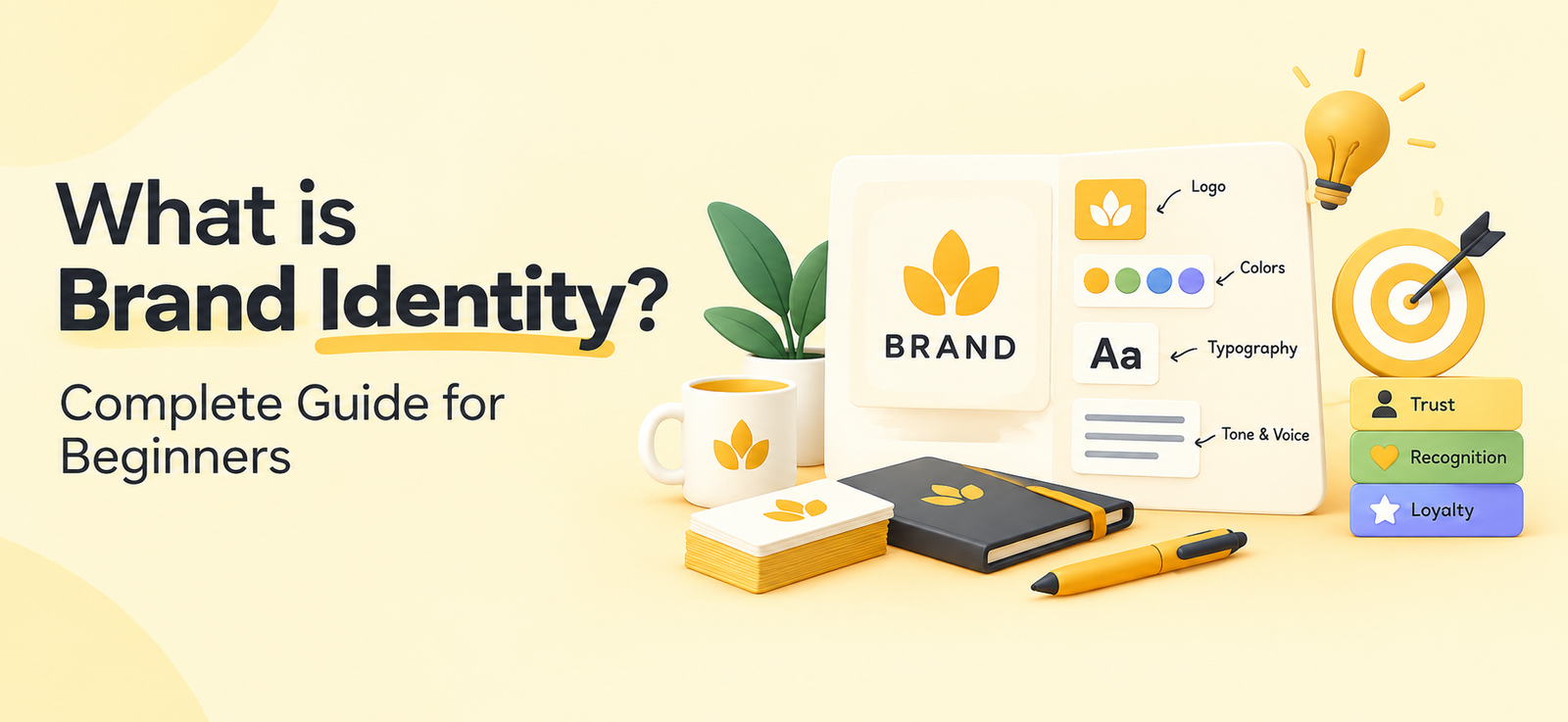
You know that feeling when you see a specific shade of red and immediately think of Coca-Cola? That’s brand identity doing its job. And if you’ve ever asked yourself “what is brand identity,” you’re already thinking like someone who takes their business seriously.
Here’s the thing. Brand identity isn’t your logo. It’s not your color palette. It’s not even your tagline. It’s the complete system of visual, verbal, and emotional signals your brand puts out into the world. It’s how people recognize you, remember you, and (ideally) choose you over the competition.
If you’re building a brand from scratch or rethinking your company branding, the smartest move is getting the identity right before you spend a single dollar on ads. A team that specializes in Creative Services can speed that up considerably, but let’s first make sure you understand what you’re building.
What is Brand Identity vs. Brand Image?
People mix these up all the time. Brand identity is what you put out. Brand image is what people take away.
Think of it this way. You choose your outfit in the morning (identity). But other people form their own opinion about how you look (image). You control one. You influence the other.
Your brand identity includes your logo, typography, colors, photography style, tone of voice, and messaging framework. Brand image lives in customer perception, reviews, word of mouth, and gut feelings.
The goal? Make your identity so clear and consistent that the image people form matches exactly what you intended.
Quick summary: Brand identity is the collection of visual and verbal elements a company creates to present itself. Brand image is how the audience actually perceives the brand. One is designed. The other is earned.
How to Create a Brand Identity That Actually Sticks
So how do you go from a blank canvas to a brand people recognize? Let’s break it down.
Start with Strategy, Not Design
Most beginners jump straight into designing a logo. That’s backwards.
Before you touch a single font or color swatch, answer these questions:
- Who exactly is your audience?
- What problem do you solve better than anyone?
- What do you want people to feel when they interact with your brand?
- Who are your top three competitors, and how do they position themselves?
Your answers become the foundation for everything that follows. Skip this step, and you’ll end up redesigning everything six months later.
Build Your Visual System
This is where most people think branding design starts (and ends). But it’s really just one layer. Your visual system typically includes:
- Logo and logo variations (wordmark, icon, horizontal, stacked)
- Color palette (primary, secondary, accent colors with hex codes)
- Typography (headline fonts, body fonts, size hierarchy)
- Photography and illustration style
- Iconography and graphic elements
Every piece should feel like it belongs to the same family. If your logo says “modern and minimal” but your Instagram posts look like a 2009 Myspace page, something’s off.
Note: When designing a brand identity, consistency beats creativity. A simple, repeatable system will always outperform a flashy one-off design that can’t scale across channels.
Define Your Voice and Messaging
Visual identity gets all the attention. But how you sound matters just as much.
Your brand voice is the personality behind the words. Are you witty and informal? Authoritative and polished? Friendly and educational? Pick a lane and stay in it.
Then build a messaging framework:
- Tagline or brand promise (one sentence that captures your value)
- Elevator pitch (30 seconds, clear and compelling)
- Key messages (3-5 points you want every piece of content to reinforce)
- Tone guidelines (how your voice shifts across contexts, like social vs. email vs. sales decks)
This is what separates forgettable company branding from brands that feel like they have a real personality.
Good Brand Identity Examples Worth Studying
You don’t have to look far for inspiration. Here are a few brands that absolutely nail it.
Mailchimp went all in on quirky illustrations, a banana-yellow palette, and a playful voice. Every touchpoint feels unmistakably Mailchimp, from their landing pages to their error messages.
Stripe took the opposite route. Clean, developer-focused, with gradient-heavy visuals and precise, no-fluff copy. Their identity signals “we’re built for serious builders.”
Notion found a sweet spot between minimal and warm. Simple black-and-white design with hand-drawn illustrations that make a productivity tool feel approachable.
What do all three have in common? Consistency. You could strip the logos off their websites, and you’d still know who they are. That’s the benchmark.
Mistakes to Avoid When Developing a Brand Identity
Beginners tend to fall into the same traps. Dodge these:
- Copying competitors. Getting inspired is fine. Cloning someone else’s look means you’ll always be the knockoff version.
- Designing by committee. Too many opinions water everything down. Set a clear decision-maker early.
- Ignoring your audience. Your brand identity is for your customers, not for you. Test it with real people before you commit.
- Skipping brand guidelines. If your team doesn’t have a documented guide, your brand will drift within months. Every freelancer, new hire, and agency partner needs the same playbook.
- Chasing trends. A gradient logo might look fresh now, but will it hold up in three years? Build for longevity.
Important: A brand identity isn’t a one-time project. It’s a living system. Plan to revisit and refine it at least annually as your company and market evolve.
FAQs
1. What is brand identity in simple terms?
Brand identity is the set of visual and verbal elements a business uses to present itself to the world. It includes your logo, colors, fonts, voice, and messaging. Together, they shape how people recognize and remember your brand across every channel.
2. How long does it take to design a brand identity?
For most small to mid-size businesses, developing a brand identity takes four to eight weeks. That covers research, strategy, visual design, and documentation. Rushing the process usually leads to rework, so it’s worth taking the time to get it right.
3. Can a small business build a strong brand identity on a budget?
Absolutely. Start with the basics: a clean logo, a two-to-three color palette, one or two fonts, and a clear brand voice. You don’t need a massive budget. You need clarity and consistency across the few channels you actually use.
4. When should a company rebrand or refresh its identity?
Consider a refresh when your brand no longer reflects what you do, when you’re entering new markets, or when your visual system feels dated compared to competitors. A full rebrand makes sense after a merger, a major pivot, or when customer perception has drifted significantly from your intended positioning.

Who Pays for Your Injuries After an Uber Accident in Richmond?

What to Consider When Ordering Packaging Samples

How Powder Coating Gets Its Tough Finish: A Beginner’s Guide

7 Benefits of Using an Online Meeting Notetaker for Modern Business Teams

All I Need in This Life of Syn – Syna World, Central Cee und Streetwear-Kultur

The Metadata and Cataloging Layer Most Enterprises Forget When Preparing Data for AI

How to Ensure Your Home is Valued Correctly for a Quick Sale

Christopher Dare: The Untold Story of Engineer and Former Husband of Angela Rippon

The 15 Highest-Paid Rugby Players in the World

What Is Fanquer? The Digital Creator Platform Transforming Direct-to-Fan Engagement

Dr Jared Ross: Missouri Appeals Court Upholds Protection Order Over Graphic Torture and Murder Threats

Who Is Azriel Crews? Inside the Life and Career of Terry Crews’ Daughter
How to Ensure Your Home is Valued Correctly for a Quick Sale
Christopher Dare: The Untold Story of Engineer and Former Husband of Angela Rippon
The 15 Highest-Paid Rugby Players in the World
What Is Fanquer? The Digital Creator Platform Transforming Direct-to-Fan Engagement
Dr Jared Ross: Missouri Appeals Court Upholds Protection Order Over Graphic Torture and Murder Threats
Who Is Azriel Crews? Inside the Life and Career of Terry Crews’ Daughter
-
 Real Estate10 months ago
How to Ensure Your Home is Valued Correctly for a Quick Sale
-
Celebrity12 months ago
Christopher Dare: The Untold Story of Engineer and Former Husband of Angela Rippon
-
 Sports6 months ago
The 15 Highest-Paid Rugby Players in the World
-
 Technology6 months ago
What Is Fanquer? The Digital Creator Platform Transforming Direct-to-Fan Engagement
-
 Celebrity6 months ago
Dr Jared Ross: Missouri Appeals Court Upholds Protection Order Over Graphic Torture and Murder Threats
-
 Celebrity9 months ago
Who Is Azriel Crews? Inside the Life and Career of Terry Crews’ Daughter
-
 Celebrity1 year ago
Nancy Hallam: The Inspiring Life, Career, and Success Story Behind Ian Wright’s Wife
-
 Celebrity1 year ago
Who Is Maisie Mae Roffey? The Private Life, Family Story, and Quiet Success of Julie Walters’ Daughter