
Technology
How To Create Print-and-Digital Invitations in 2026: A Practical Workflow for Custom Invitation Makers

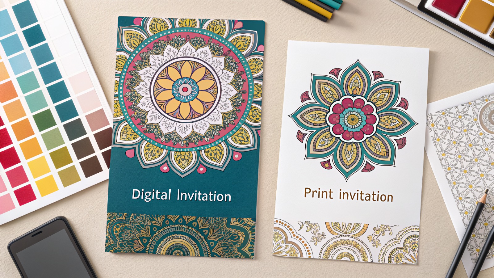
This guide explains a simple workflow for making invitations that read clearly, export cleanly, and work for both printing and digital sharing.
Introduction
Invitations do two jobs at once: they communicate practical details (when, where, RSVP) and set expectations about the tone of an event. When either part is unclear, hosts spend extra time answering follow-up questions or correcting mix-ups.
This tutorial is meant for anyone who needs invitations fast but does not use design software regularly. The emphasis is on steps, decisions, and checkpoints that prevent common problems like crowded layouts, missing RSVP info, and print files that crop unexpectedly.
Custom invitation makers differ mainly in how they handle layout assistance (templates, alignment, font pairing), output options (print-ready PDF versus phone-friendly images), and revision flow (duplicating versions, swapping colors or photos, and keeping details consistent across edits).
Adobe Express is a practical place to begin because it provides invitation templates, straightforward editing, and export/print options in one browser workflow.
STEP-BY-STEP HOW-TO GUIDE for Using Custom Invitation Makers
Step 1: Choose a template and set the invitation format
Goal
Start with a layout that matches your event and the way guests will receive the invite.
How to do it
- To print invitations with Adobe Express, pick a template that fits the event style (formal, casual, kids, business).
- Decide whether the invitation will be digital-only, print-only, or both.
- Select a standard size early (postcard-style or common print sizes) to avoid resizing later.
- Rename the project with a version label (for example, Invite_v01) before major edits.
- Remove template elements that reduce readability (busy patterns behind text, tiny decorative captions).
What to watch for
- Templates can look good on screen but include type that is too small for printing.
- Dark backgrounds can look muddy on home printers.
- Switching sizes late can cause text to reflow and spacing to drift.
Tool notes
- Adobe Express is useful for quick template setup and fast revisions.
- If you need precise sizing guides before designing, Figma can help establish a frame and safe margins.
Step 2: Write the details first and keep them unambiguous
Goal
Lock the core information so layout changes don’t trigger last-minute rewrites.
How to do it
- Draft the essentials: host/occasion, date, start time (and end time if relevant), full address, RSVP method, RSVP deadline.
- Add one optional line only if it prevents confusion (dress code, parking note, gate code, “adults stay,” “drop-off”).
- Standardize time format (e.g., “6:30 PM”) and include a time zone if guests may travel.
- Verify the address by pasting it into a map app and confirming it resolves correctly.
- Decide whether to include the year on the date (useful for invites that get forwarded).
What to watch for
- Missing RSVP deadline leads to unclear headcounts.
- Long paragraphs force small type and reduce readability.
- Informal phrasing can become ambiguous (“after dinner,” “early afternoon”).
Tool notes
- Google Docs can help finalize wording and reduce typos before layout.
- If RSVPs will be collected via a form, Google Forms can keep responses organized without changing the invite design.
Step 3: Build hierarchy so the invite reads in seconds
Goal
Make the invitation scannable so guests can find the key details quickly.
How to do it
- Make the event title (or honoree name) the largest text element.
- Put date/time as the second tier; location and RSVP as the third tier.
- Limit to one or two fonts; use size and weight for variety.
- Keep line lengths short and add spacing between sections.
- Use consistent alignment: centered for simple designs, left-aligned for detail-heavy layouts.
What to watch for
- Centering long blocks of text reduces readability.
- Thin scripts can print poorly and become hard to read on phones.
- Too many decorative elements compete with the details.
Tool notes
- Adobe Express supports quick font and spacing changes across templates.
- Canva is often used to explore alternate type pairings and spacing styles when the template needs a different feel.
Step 4: Add a photo or theme elements without reducing clarity
Goal
Personalize the invitation while keeping text readable.
How to do it
- Use one strong visual (photo, icon set, or illustration) rather than several small ones.
- Crop photos tightly so the subject is clear even at small size.
- Put text on a solid block or overlay if it sits on an image background.
- Keep decorative items away from the RSVP and address area.
- Check contrast in the smallest view (thumbnail/phone preview).
What to watch for
- Low-resolution photos can look fine digitally but print soft.
- Busy backgrounds reduce contrast and make small text hard to read.
- Over-themed designs can push essential details to the margins.
Tool notes
- Adobe Express works well for quick photo placement and overlays.
- If a photo needs cleanup (brightness/contrast, background simplification), Adobe Photoshop is commonly used before importing it into the invite.
Step 5: Check margins, safe areas, and (if printing) bleed concepts
Goal
Prevent cropping surprises and keep important text away from edges.
How to do it
- Keep all critical text inside a consistent internal margin (safe area).
- If the design has a border, make it thick enough that small trimming shifts won’t look accidental.
- For print, avoid placing text near corners where trimming variation is most noticeable.
- If a printer requests bleed, extend backgrounds beyond the trim edge while keeping text inside the safe area.
- Do a final phone preview to ensure RSVP details remain readable.
What to watch for
- Text near edges is the most common reason print invites get reworked.
- Very thin borders can look uneven after trimming.
- Bleed requirements vary; ignoring them can create unwanted white borders.
Tool notes
- Figma can help with precise guides for margins and bleed zones.
- Adobe Express is useful for quick repositioning once a safe-area issue is spotted.
Step 6: Export the right files for printing and sharing
Goal
Create clean outputs that look good on phones and print reliably.
How to do it
- Export a print-ready PDF for printing workflows.
- Export a separate PNG/JPG for texting and social sharing (chat apps often compress PDFs).
- Open each export and confirm spacing, text rendering, and sharpness.
- Name files clearly (e.g., Invite_Print.pdf, Invite_Text.png) and store them together.
- Keep the editable source file unchanged so last-minute updates are simple.
What to watch for
- Low-resolution exports can make small text look fuzzy.
- Some exports can shift text slightly; always review the exported file itself.
- Sending an image through messaging apps can compress it; test with one recipient if needed.
Tool notes
- Adobe Express supports common export formats for print and digital sharing.
- Adobe Acrobat can help combine front/back pages into one PDF if you create a two-sided invitation.
Step 7: Manage distribution and RSVPs as a small workflow
Goal
Keep responses and updates organized so details don’t fragment across messages.
How to do it
- Choose one RSVP channel (text, email, form) and keep it consistent.
- Track responses in a single list with notes (dietary needs, plus-ones, pickup/drop-off).
- If details change, update the source file once and re-export with a new version label.
- Send updates with the corrected detail written plainly in the message (not only as an attachment).
- Archive the final version in a single folder so the “current” invite is easy to find.
What to watch for
- RSVPs spread across multiple channels lead to inaccurate counts.
- Multiple invite versions can circulate after a time/location change.
- Missing notes (allergies, supervision rules) can create day-of problems.
Tool notes
- For planning and task tracking (not design), Asana (project management) can track RSVP follow-ups and logistics without overlapping with invitation tools.
Common Workflow Variations
- Digital-only invitation: Use larger type and fewer lines since most guests will read on phones. Export a dedicated image version to avoid message app compression.
- Print + digital: Export a print PDF and a separate phone-friendly PNG/JPG. Keep both tied to one source design so the details match.
- Photo-based invitation: Start with a single strong photo and keep text minimal. If the photo is dim or busy, edit it first so text remains legible.
- Theme-based invitation: Use theme graphics as accents (corners/borders) and reserve the center for details. This avoids sacrificing clarity for decoration.
- Multiple time slots or locations: Duplicate the invite and change only the time/location block, then label versions clearly to prevent mix-ups.
Checklists
Before you start checklist
- Event type and tone decided (formal/casual/kids/business)
- Date, start time, and end time confirmed (include time zone if relevant)
- Location confirmed and tested in a map app
- RSVP method chosen and RSVP deadline set
- Guest list rough count estimated
- Photo/theme assets gathered (optional) and rights confirmed
- Print vs digital decision made
- Timeline includes printing, mailing, or last RSVP date
- File naming plan for versions (v01, v02)
Pre-export / pre-order checklist
- Event title/name is the largest, most readable element
- Date/time/location are clear and unambiguous
- RSVP method and deadline included and easy to spot
- Safe margins used; text not close to edges
- Photo/graphics do not reduce contrast behind text
- Spelling checked (names, address, apartment number, URL)
- Exported PDF opened and reviewed (print version)
- Exported image opened and reviewed (digital version)
- Files named clearly and stored together
Common Issues and Fixes
- Text looks too small on phones.
Increase font size and shorten copy. Move optional notes into a follow-up message instead of shrinking everything to fit. - Printed invites clip text near the edge.
Increase safe margins and keep key details away from corners. Trimming can shift slightly even when paper size is correct. - Colors look darker or duller when printed.
Use stronger contrast and avoid large dark backgrounds on home printers. A light background with dark text is typically more predictable. - The address or RSVP line gets missed.
Give it its own line with extra spacing and consider a label (“RSVP by…”, “Address:”). Scannable structure reduces errors. - Photo backgrounds make details unreadable.
Place text on a solid overlay or move details into a clean block. Avoid placing RSVP and address lines on textured areas. - Multiple versions circulate after a change.
Use version labels and keep one “current” file in a single folder. Re-export from the source file rather than editing exported images.
How To Use print invitations with Adobe Express: FAQs
FAQ 1: Is it better to start from a template or start from the event details?
If details are settled, starting from the details helps you choose a template that fits without shrinking text. Template-first is faster, but it often needs rework once the final address and RSVP method are known.
FAQ 2: Should invitations be designed for print first or digital first?
Digital-first designs can use fewer details and larger type for phones. Print-first designs should prioritize safe margins and predictable contrast. Many hosts export two versions from one source file.
FAQ 3: When is a PDF necessary?
PDF is useful when printing because it preserves layout and text more reliably. For texting and group chats, a separate PNG/JPG is often easier to view.
FAQ 4: What’s the tradeoff between print-to-order and exporting a file?
Print-to-order can simplify handoffs, while exporting a file gives flexibility for local printing. Export workflows require extra attention to size, margins, and reviewing the final PDF.
FAQ 5: How can a series of invitations stay consistent across events?
Use one master template with consistent fonts, spacing, and layout tiers. Duplicate it and change only the details and accents, which reduces layout drift and errors.

Technology
AI-Generated Nano Banana 2.1 Visuals: What Shopify Beauty Ecommerce Brands Should Check Before Publishing


Launching a skincare collection on Shopify under tight marketing deadlines often tempts creative teams to rush generative assets straight from prompt outputs to live product detail pages. When an autumn serum launch is forty-eight hours away, producing lifestyle scenes on demand feels like a massive relief compared to booking studio shoots and hiring retouchers. Yet in cosmetics merchandising, photorealism is not an aesthetic bonus—it is the baseline of consumer trust. A shopper scrutinizing an amber dropper bottle will abandon checkout the moment a glass reflection bends unnaturally, an active ingredient label turns into illegible glyphs, or a model’s cheek exhibits the plastic, airbrushed sheen typical of uncurated machine outputs. The fundamental trap in nano banana 2.1 generative workflows is confusing rendering speed with production viability; an asset that looks stunning at a thumbnail glance can easily destroy brand credibility once zoomed on a high-resolution mobile display.
Deploying newer generative engines like nano banana 2.1 provides digital merchandisers with remarkable control over lighting and multi-reference fidelity, but tool precision cannot replace editorial judgment. Beauty buyers assess product safety, texture feel, and ingredient efficacy through visual cues alone. If your Shopify store presents synthetic artifacts as commercial reality, return rates and ad acquisition costs rise immediately. Establishing an uncompromising visual gatekeeping protocol ensures your creative department leverages nano banana 2.1 capabilities without eroding customer confidence.
The Core Quality Standard for Nano Banana 2.1 in Beauty Ecommerce
The commercial threshold for visual content in beauty ecommerce differs fundamentally from apparel or home goods. In fashion, minor drape variations or ambient styling liberties rarely trigger doubts about fabric authenticity. In prestige skincare, however, visual artifacts immediately signal counterfeit goods or deceptive advertising. When configuring production pipelines with nano banana 2.1, visual teams must evaluate output assets against three foundational parameters: material truth, functional plausibility, and consumer expectation.
Material truth requires that packaging substances rendered in nano banana 2.1 behave according to real-world physics. Amber glass must refract light with appropriate density; frosted acrylic jars must diffuse backlight rather than creating metallic glares; and cosmetic liquids must exhibit realistic viscosity. When rendering an anti-aging cream, the emulsion surface inside an open jar must display authentic surface tension rather than generic digital gloss. Functional plausibility demands that primary packaging elements generated by nano banana 2.1—dropper bulbs, airless pump nozzles, dropper pipettes, and cap threading—show precise industrial logic. If a pump dispenser lacks a realistic dispensing seam or sits off-center on the bottle neck, discerning skincare shoppers sense an amateur presentation.
Teams integrating nano banana 2.1 via Defapi into automated asset pipelines frequently discover that while the underlying Gemini 3.6 Flash multimodal engine handles text and scene composition with high fidelity, visual standards must be codified programmatically. Rather than measuring nano banana 2.1 success by subjective artistic flair, beauty brands must define visual quality as the absence of friction between what the shopper sees on a Shopify collection page and what arrives inside the unboxing package.
Non-Negotiable Visual Elements in Skincare and Cosmetics Assets
To prevent costly post-launch rollbacks when evaluating nano banana 2.1 renders, creative directors must separate minor stylistic nuances from catastrophic failure modes. The following three visual elements are strictly non-negotiable across every digital touchpoint:
- Packaging Geometry and Component Integrity: In any nano banana 2.1 render, cylindrical bottles must not taper irregularly, pump collars must align flush with container shoulders, and dropper pipettes immersed in liquid must demonstrate proper optical index refraction. Any asset showing skewed cap seams or melted nozzle tips must be rejected instantly.
- Primary Label Readability and Typographic Fidelity: The primary display panel (PDP) of a cosmetic container in nano banana 2.1 assets is legally regulated and emotionally reassuring. Active ingredient names (such as “2% Hyaluronic Acid” or “Niacinamide Serum”), volumetric callouts, and brand wordmarks must remain crisp and perfectly planar to the container contour. Synthetic smudging across typography in nano banana 2.1 visuals destroys customer confidence faster than poor background staging.
- Organic Skin Topography and Authentic Texture: Beauty shoppers reject images where human skin generated by nano banana 2.1 appears completely poreless, rubberized, or airbrushed into a uniform tonal blur. Natural skin contains fine micro-creases, subtle vascular undertones, and microscopic follicle details. If an asset displays waxy highlights on cheekbones or blurred jawlines, it violates commercial standards.
| Quality Inspection Parameter | Commercial Non-Negotiable Standard | Critical Failure Trigger |
| Container Structural Geometry | Precise 90-degree base alignments, symmetrical neck rings, uniform wall thickness | Warped glass walls, asymmetrical dispenser nozzles, melted pump collars |
| Typography and Label Architecture | Legible formulation names, sharp typography alignment, accurate tracking | Warped letterforms, gibberish characters, curved text breaking container perspective |
| Model Facial & Cuticular Anatomy | Authentic epidermal grain, natural follicular pores, distinct nail margins | Plasticized skin finish, merged finger joints, hyper-glossy artificial highlights |
| Liquid & Emulsion Mechanics | Correct meniscus curve, authentic opacity, realistic surface refraction | Floating fluid droplets, cloudiness in clear solutions, disconnected dropper drops |
When generating seasonal variations, teams operating nano banana 2.1 must prioritize these non-negotiables over background atmosphere. A gorgeous Parisian marble bathroom scene means nothing if the bottle label resting on the vanity is blurred or warped.
Acceptable Production Trade-Offs for Fast Creative Iteration
While product containers and human textures demand absolute fidelity in nano banana 2.1 outputs, insisting on absolute perfection across secondary scene elements paralyzes creative velocity. Merchandising teams producing dozens of localized ad variations or seasonal promotional headers with nano banana 2.1 must identify where artistic trade-offs are safe and commercially harmless.
Background foliage, atmospheric depth, and auxiliary lifestyle props do not represent your commercial offer in nano banana 2.1 lifestyle scenes. If an autumn botanicals campaign features slightly stylized eucalyptus leaves or abstract marble vein patterns in soft focus, these simplifications do not undermine the authenticity of the featured moisturizer. In lifestyle compositions rendered via nano banana 2.1, shallow depth of field (bokeh) is an effective tool: blurring background bathroom tiles or morning window sunlight directs customer attention toward the sharp, uncompromised product packaging.
Similarly, secondary lighting reflections on peripheral background mirrors or non-branded vanity trays can carry minor generative stylizations without consequence. When running high-throughput creative tests via Defapi developer endpoints, beauty operators can tolerate mild abstraction in ambient environmental textures while enforcing strict mask-based preservation on the product bottle itself. Nano banana 2.1 supports up to fourteen multi-reference inputs, enabling teams to lock primary SKU dimensions while letting background environments flex dynamically across spring, summer, and holiday merchandising themes.
A Practical Verification Routine Before Publishing to Shopify
Before pushing newly generated visual assets from nano banana 2.1 into a live Shopify theme, performance teams should apply a structured four-step inspection routine:
[Master Render Output]
│
▼
[Step 1: 400% Zoom Typography & Seam Audit] ──► Failed ──► Mask-Edit / Reject
│
Passed
▼
[Step 2: Pantone & Formula Color Calibration] ──► Failed ──► Color-Grade / Re-prompt
│
Passed
▼
[Step 3: Multi-Device Contrast & Scale Check] ──► Failed ──► Re-crop / Re-balance
│
Passed
▼
[Step 4: Contextual Channel Cohesion Review] ──► Approved for Storefront Publishing
- Step 1: The 400% Zoom Audit: Open the rendered asset in a calibrated viewer and zoom directly into the typography, pump dispenser nozzle, and cap threading. Confirm that letters remain legible without generative distortion. If the label displays synthetic artifacts, deploy targeted mask editing in nano banana 2.1 to replace only the text region rather than regenerating the entire image.
- Step 2: Pantone and Formula Color Calibration: Skincare brands rely heavily on proprietary pastels, amber tints, and tinted serum hues. Compare the liquid tone rendered by nano banana 2.1 against your physical lab standard. A vitamin C formulation rendered in nano banana 2.1 with excessive neon yellow instead of an authentic pale amber finish misleads shoppers regarding product freshness and oxidation.
- Step 3: Multi-Device Scale and Contrast Check: Inspect the image at standard desktop dimensions (1600px width) and scaled down to a 375px mobile viewport. Ensure high contrast between the product silhouette and the lifestyle backdrop so the container stands out clearly on mobile feeds.
- Step 4: Contextual Placement Alignment: Verify that the asset fits its exact store placement. A hero banner requires negative space for typography overlays, while a square collection card demands centered visual gravity with zero edge cropping on the bottle cap.
Establishing this routine eliminates guesswork and prevents flawed visual experiments from reaching high-intent store visitors.
Building a Multi-Asset Consistency System Across the Catalog
The true test of generative image workflows with nano banana 2.1 is not producing a single heroic product shot, but scaling visual cohesion across twenty distinct SKUs. If your brightening cleanser appears under crisp Scandinavian daylight while the matching night cream looks bathed in warm editorial studio tungsten, your Shopify collection page will appear disjointed and unprofessional.
To build systemic harmony, beauty ecommerce brands must construct unified lighting and perspective templates. Standardize key lighting angles (such as 45-degree top-left key lights with gentle bounce fill) and lock camera elevation across all product listing images. When referencing multiple products in an evening routine bundle, leverage the multi-object coherence features of nano banana 2.1 to guarantee that container scales remain proportional. A 30ml eye cream bottle must never appear larger than a 100ml facial toner sitting beside it on the same digital shelf.
Furthermore, centralized API architecture via Defapi enables marketing teams to automate reference prompt conditioning and asset tagging across seasonal catalogs. By linking your Shopify product taxonomy directly to standardized reference profiles, creative teams can refresh hero visuals across multiple product categories simultaneously without losing brand uniformity. Generative visual production is no longer an experimental novelty for beauty brands; managed under rigorous quality standards and structured review systems, it becomes a dependable engine for commercial growth.

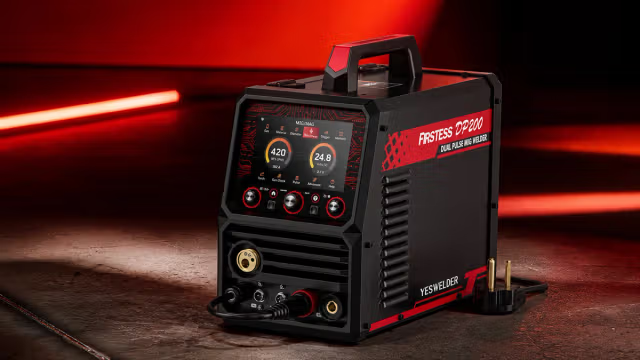
A workshop can get crowded quickly. A MIG welder here, a TIG machine there, and a plasma cutter that only comes out when a project needs one. Add gas cylinders, cables, torches, and consumables, and a garage can run out of usable space sooner than expected.
For DIYers and home fabricators, an all-in-one machine can be a practical alternative, especially when different projects call for different processes.
A Closer Look at the YESWELDER FIRSTESS MP200 PRO
The YESWELDER FIRSTESS MP200 PRO is a multi-process welder that combines MIG, TIG, stick welding, plasma cutting, and metal cleaning in one machine.
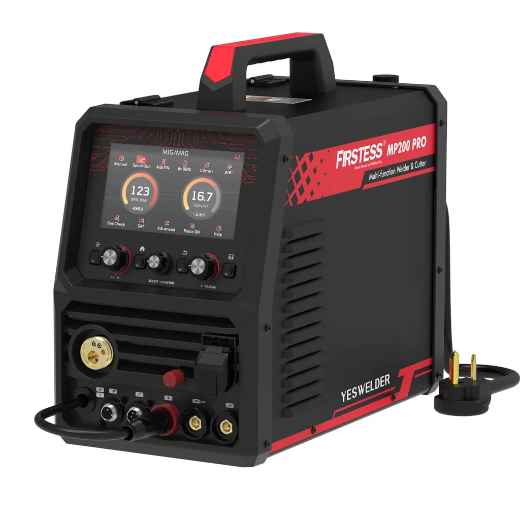
With 120V/240V input, it is designed for a wide range of projects, from repairing brackets and cutting sheet metal to building custom frames and tackling more demanding garage fabrication.
The machine supports:
- MIG and Pulse MIG
- Flux-cored welding
- HF/Lift TIG and Pulse TIG
- Stick and Pulse Stick
- Plasma cutting
- Metal cleaning
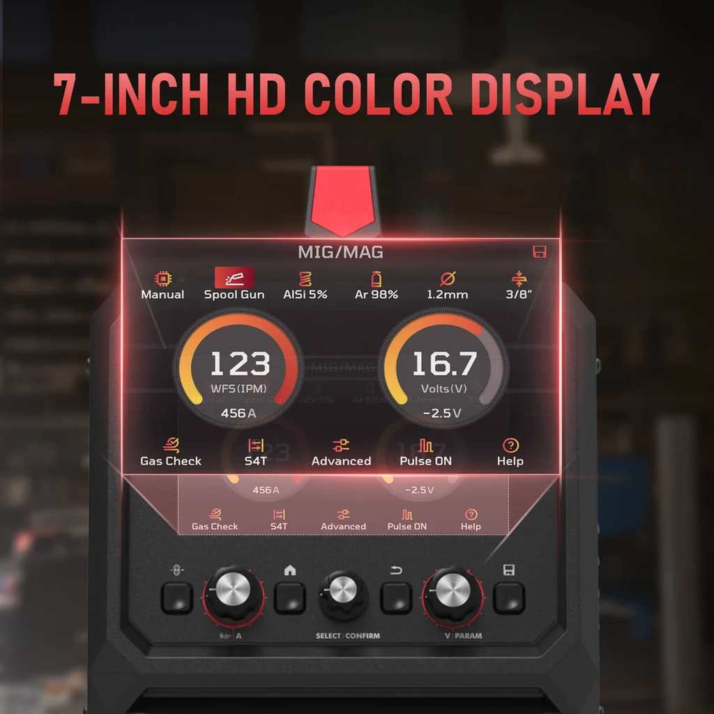
A 7-inch full-color HD display puts the main welding parameters and settings in one place. For users switching between processes, this is more convenient than working through a small, basic display.
One Machine for Different Welding Jobs
The advantage of a multi-process machine becomes clearer when a project involves more than one type of work.

MIG and Pulse MIG
MIG is a practical choice for brackets, frames, workbenches, repairs, and general fabrication. The MP200 PRO also offers Pulse MIG for greater control over the arc and weld pool, with less spatter.
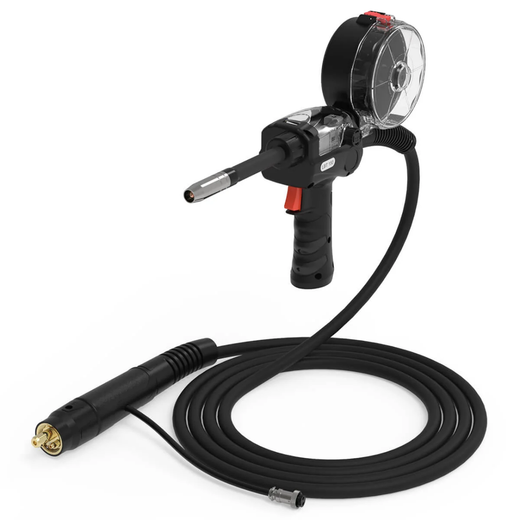
It supports steel, stainless steel, and aluminum. For aluminum MIG welding, it works with compatible AlSi5 or AlMg5 wire and can be paired with the optional LBT150 spool gun.
TIG and Pulse TIG
TIG is useful when you need more control over the weld. The MP200 PRO provides HF and Lift TIG, along with Pulse TIG.
These modes are suited to steel and stainless steel projects where heat control and weld appearance matter, particularly on smaller or more detailed parts.
Stick Welding
Stick welding remains useful for repairs and outdoor work, especially when using shielding gas is inconvenient. The MP200 PRO supports standard and pulse stick welding and is E6010 capable.
Plasma Cutting and Cleaning
The built-in plasma cutter can handle steel, stainless steel, and aluminum, making it useful for cutting plate and sheet metal during fabrication.
At 240V, the rated clean-cut thickness is up to 3/8 inch, with a severance capacity of up to 1/2 inch.
The machine also includes a cleaning function for post-weld metal surface treatment. While it may not be needed for every project, having it available can eliminate the need for another piece of equipment.
Made for Real-World Workshops
Not every welder has a dedicated fabrication shop. Many projects happen in garages, home workshops, or shared spaces where storage and floor space are limited.
The MP200 PRO is built around that reality. Its 120V/240V dual-voltage input allows users to work with the power available in their workshop. On 120V, MIG, TIG, and stick output go up to 120A. On 240V, MIG and TIG output reach 200A.
At 240V, MIG, TIG, and stick welding can handle recommended material thicknesses up to 3/8 inch, depending on the process and material.
The machine also offers both synergic and manual modes. Synergic mode helps simplify initial setup, while Manual mode gives experienced users more control over individual parameters.
What Can You Build With It?
The most useful way to look at a multi-process welder is by the projects it can support.
A home workshop might use it to build a steel workbench, repair a frame, fabricate brackets, make storage racks, or work on outdoor metal projects.
Automotive fabrication is another natural application. A single project may involve cutting plate, fitting components, tack welding, and finishing smaller joints with TIG. Being able to switch between processes on the same machine can make that workflow more straightforward.

The same applies to creative projects such as metal furniture, sculptures, garden structures, and other custom pieces.
Features That Make a Difference
The MP200 PRO includes several features aimed at making everyday operation simpler.
Triple Pulse Modes
Pulse is available in MIG, TIG, and stick welding. Depending on the material and settings, pulse operation can help with arc stability, puddle control, and spatter reduction.

Synergic and Manual Modes
Synergic mode provides a quicker starting point for setup, while Manual mode lets experienced welders fine-tune the machine to suit a particular material or project.
Upgradeable Firmware
The firmware can be updated to add features, improve performance, and introduce new welding parameters. For a machine intended to stay in a workshop for years, upgradeability is a useful feature.
Aluminum-Ready Setup
The MP200 PRO can handle aluminum MIG applications with compatible wire and can be used with the optional LBT150 spool gun. This gives users another option when a project goes beyond steel and stainless steel.
Who Is the MP200 PRO For?
An all-in-one welder is not necessarily the right choice for every workshop.
It can make sense for:
- DIY makers
- Garage fabricators
- Home workshop owners
- Users with limited workspace
- People who regularly switch between welding and cutting
- Beginners who want simpler setup options
A dedicated machine may be more appropriate for highly specialized work. For example, someone focused mainly on AC TIG aluminum welding may need capabilities beyond those offered by this type of multi-process platform. Similarly, high-volume industrial production calls for equipment designed specifically for that environment.
A Practical All-in-One Workshop Setup
Metalworking projects rarely stick to one process. A single job might involve cutting, fitting, welding, and cleaning before it is finished.
That is where the FIRSTESS MP200 PRO fits. By combining several welding processes with plasma cutting and cleaning, it gives DIYers and garage fabricators a practical way to handle different stages of a project with one machine.
For users who value flexibility but don’t have unlimited space, an all-in-one setup can be a straightforward way to keep projects moving while keeping the workshop a little less crowded.
To learn more, visit the YesWelder Official Store to explore a range of welders, welding helmets, consumables, and accessories for different projects and workshop needs.


The AMD Ryzen X3D processor series represents a significant advancement in the realm of gaming CPUs, offering enthusiasts a robust combination of speed, efficiency, and enhanced graphics performance. This guide aims to explore the intricacies of the AMD Ryzen X3D, providing gamers with insights on how to harness its full potential for an unparalleled gaming experience.
To start with, the x3d architecture introduces innovative 3D V-Cache technology that substantially increases the amount of L3 cache available on the processor die. This increase in cache results in reduced latency and improved data access times, paramount for the demanding processes involved in modern gaming.
Understanding 3D V-Cache Technology
Traditional CPU designs incorporate cache memory adjacent to processor cores on a single plane. However, the AMD Ryzen X3D series stacks additional cache vertically using 3D V-Cache technology. This vertical integration allows a substantial increase in cache capacity without significantly enlarging the processor’s footprint.
The augmented cache enables quicker retrieval of gaming assets and instructions by minimizing the distance data travels. Consequently, this reduces frame times and leads to smoother gameplay, especially in games that are sensitive to cache size and latency.
Performance Benefits for Gamers
The primary beneficiary of the 3D V-Cache is gaming performance. Benchmarks demonstrate that Ryzen X3D processors achieve higher frame rates and lower latency compared to their non-3D counterparts, particularly in CPU-bound games such as strategy, simulation, and role-playing games.
This performance edge is amplified when paired with high-end graphics cards and fast memory modules, creating a synergistic effect that maximises the hardware capabilities. With the right configuration, gamers can expect a more responsive and immersive experience.
Choosing the Right Ryzen X3D for Your Setup
AMD offers several variants within the Ryzen X3D lineup, each catering to different performance tiers and budgets. Understanding the differences in core count, clock speeds, and cache size is essential when selecting the appropriate processor for a specific gaming rig.
Moreover, compatibility with motherboards and cooling solutions should be carefully considered to ensure optimal thermal management and power delivery, which directly impact the processor’s sustained performance during intensive gaming sessions.
Optimising System Configuration
Beyond the processor itself, achieving peak performance with the AMD Ryzen X3D involves fine-tuning system components and software settings. Updating BIOS and drivers ensures compatibility and stability, while adjusting in-game settings can leverage the processor’s capabilities more effectively.
It is also advisable to employ high-speed DDR4 or DDR5 memory modules, as memory speed can influence the processor’s performance, notably in CPU-bound scenarios. Adequate cooling, through either advanced air coolers or liquid cooling solutions, helps maintain stable frequencies and prevents thermal throttling.
Comparison with Other High-Performance Processors
Compared to previous generation AMD Ryzen processors and competitors in the market, the X3D models stand out for their superior cache design. While raw clock speeds may be comparable, the enlarged cache grants the Ryzen X3D a distinct advantage in gaming workloads.
This advantage translates into more consistent frame times and generally smoother visual output, which are critical metrics for serious gamers and streamers aiming for high-quality content delivery.
Future-Proofing Your Gaming Build
The integration of 3D V-Cache positions the Ryzen X3D series well for upcoming titles that demand heightened computational resources. Investing in this technology ensures a level of preparedness for next-generation games that leverage CPU cache to improve performance.
Additionally, the energy efficiency improvements in the Ryzen X3D series contribute to quieter and cooler operation, factors increasingly valued in modern gaming setups that prioritise comfort and acoustics.
Conclusion
Unlocking peak performance with the AMD Ryzen X3D involves understanding the transformative impact of 3D V-Cache technology and meticulously aligning system components to support its strengths. Gamers seeking to elevate their gameplay quality will find the Ryzen X3D a compelling choice in the current market landscape.
For those interested in exploring the range of AMD Ryzen X3D processors, reputable suppliers such as Scorptec Computers provide access to the latest models, ensuring customers can equip themselves with cutting-edge hardware primed for exceptional gaming performance.

Staying in Chora With Little Venice at Your Door

AI-Generated Nano Banana 2.1 Visuals: What Shopify Beauty Ecommerce Brands Should Check Before Publishing

YesWelder FIRSTESS MP200 Pro: One Machine for Welding, Cutting, and More


How to Prepare for a Future Property Auction in London

Why the Rolex Jubilee Bracelet Remains a Practical Choice for Everyday Wear

The 15 Highest-Paid Rugby Players in the World

Christopher Dare: The Untold Story of Engineer and Former Husband of Angela Rippon

How to Ensure Your Home is Valued Correctly for a Quick Sale

What Is Fanquer? The Digital Creator Platform Transforming Direct-to-Fan Engagement

Dr Jared Ross: Missouri Appeals Court Upholds Protection Order Over Graphic Torture and Murder Threats

Nancy Hallam: The Inspiring Life, Career, and Success Story Behind Ian Wright’s Wife
The 15 Highest-Paid Rugby Players in the World
Christopher Dare: The Untold Story of Engineer and Former Husband of Angela Rippon
How to Ensure Your Home is Valued Correctly for a Quick Sale
What Is Fanquer? The Digital Creator Platform Transforming Direct-to-Fan Engagement
Dr Jared Ross: Missouri Appeals Court Upholds Protection Order Over Graphic Torture and Murder Threats
Nancy Hallam: The Inspiring Life, Career, and Success Story Behind Ian Wright’s Wife
-
 Sports5 months ago
The 15 Highest-Paid Rugby Players in the World
-
Celebrity11 months ago
Christopher Dare: The Untold Story of Engineer and Former Husband of Angela Rippon
-
 Real Estate8 months ago
How to Ensure Your Home is Valued Correctly for a Quick Sale
-
 Technology4 months ago
What Is Fanquer? The Digital Creator Platform Transforming Direct-to-Fan Engagement
-
 Celebrity4 months ago
Dr Jared Ross: Missouri Appeals Court Upholds Protection Order Over Graphic Torture and Murder Threats
-
Celebrity11 months ago
Nancy Hallam: The Inspiring Life, Career, and Success Story Behind Ian Wright’s Wife
-

 Health9 months ago
Enclomimed 25 (Enclomiphene) – Effective PCT Protocol
-

 Celebrity7 months ago
Who Is Azriel Crews? Inside the Life and Career of Terry Crews’ Daughter